Brand & design
One pouch, one meme. A name with room for personality.
A look at the words, colors and small visual details that make a brand feel like itself.
Start with the name.
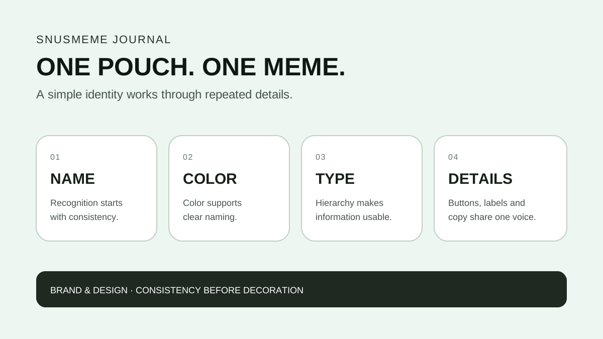
SNUSMEME — one pouch, one meme. The name and line give this brand concept a direct, conversational starting point. The design can be expressive, but the name should stay easy to recognize wherever it appears: at the top of a website, on a label or in a partner presentation.
A useful identity does not need a different idea on every surface. Repeating a small set of choices can give a website and its packaging references a shared character. The wordmark, the spacing around it and the way a flavor name is written are all part of that consistency.
Give color a job.
Color can help distinguish one flavor direction from another. A mint reference might use a cool green; a grape reference might use purple. Those associations provide a starting point for the visual system, while a clearly written flavor name carries the information.
The same principle applies on screen. A product card, its detail page and an inquiry selection should use the same name. A visitor should not have to interpret a color swatch to understand what they are viewing. Contrast, readable type and text labels matter as much as the palette.
Make room for both personality and clarity.
A large headline can carry the mood of a page. Smaller supporting text has a different job: helping people navigate, compare the available information and decide what to ask next. Keeping those roles clear makes a playful visual direction easier to use.
One practical review is to remove all decorative elements and read the page again. Is the brand name still obvious? Can someone find the flavor collection, the story behind the brand and the contact route? If those essentials remain clear, the design has a useful foundation.
Check the small moments.
An identity also lives in the details between the big visuals. Button labels, article headings and form instructions should sound as though they belong to the same brand. Short, specific language helps the visitor move through the site without having to decode the tone.
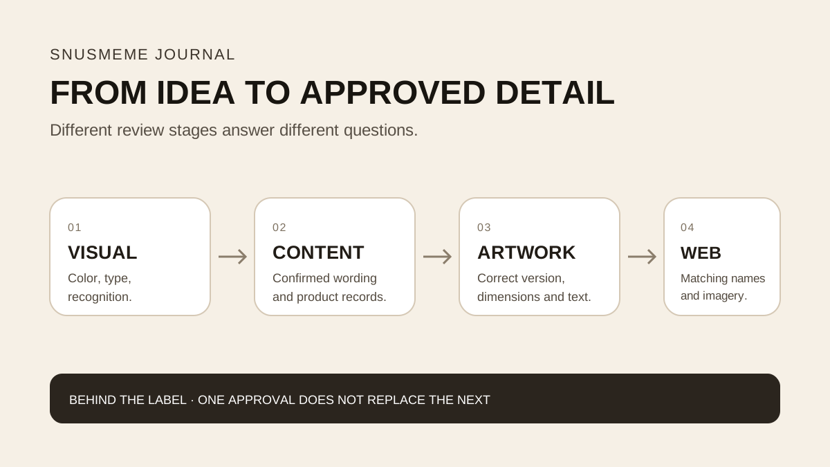
The visual language shown here offers a way to review that consistency. Final artwork and product information can be checked separately before publication. A memorable first impression works best when the next step is just as clear.